Most Recent 40 Tweets
Not including replies or retweets or mentions.
Mood
⬅️ New
⬆️ 🙂
⬇️ 🙁
⬇️ 🙁
Tweets
-
I spoke too soon about round tripping smart components (see the excellent clarification below from simoncozens ) But I’m am very much excited about this proposal for Variable Components in UFO by justvanrossum and blackfoundry github.com/BlackFoundryCom/variable-components-in-ufo cjtype/1583861071265210368
-
(yes, I’m reading FontTools release notes on a Sat morning 🤓) -Extrapolation is now possible with varLib! -There is now support for round tripping smart components between Glyphs and UFO, which means UFO can store them. Who will make the RF plugin? github.com/fonttools/fonttools/releases/tag/4.38.0
-
Wow, this is huge. I’ve been wanting to do this since the first variable fonts I made in 2016, and it’s amazing that this is now possible. Huge thank you to behdadesfahbod for all the work you’ve done for variable fonts over the years🍻 FontTools/1583527757891633154
-
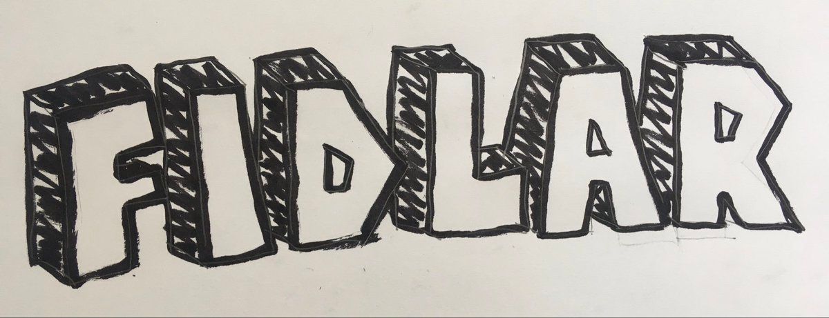
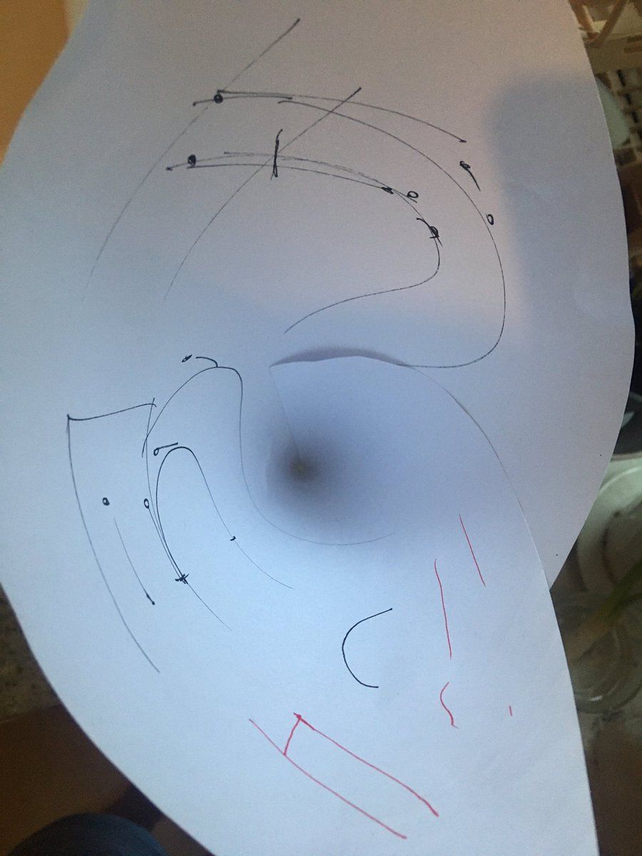
I designed this graphic for my friends FIDLAR and here’s the original sketch FIDLAR/1582484622549561344
-
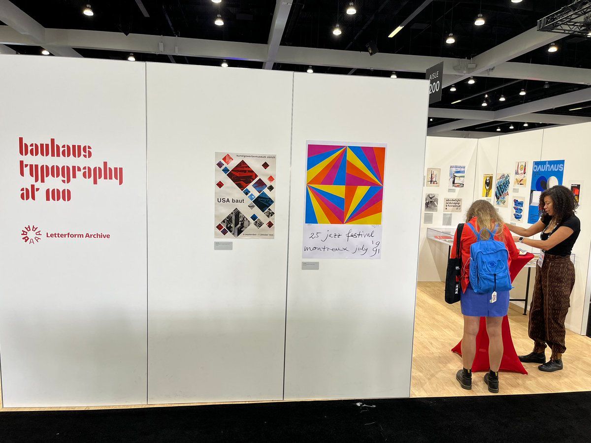
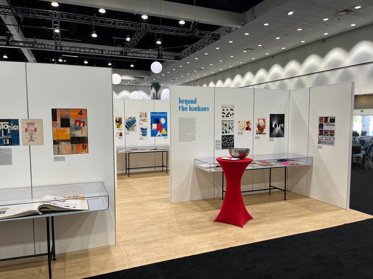
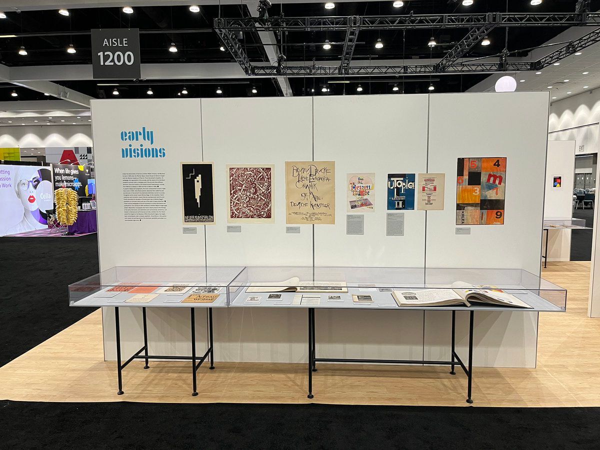
If you’re attending #AdobeMax make sure to check out the wonderful Bauhaus exhibition at the Lett_Arc booth
-
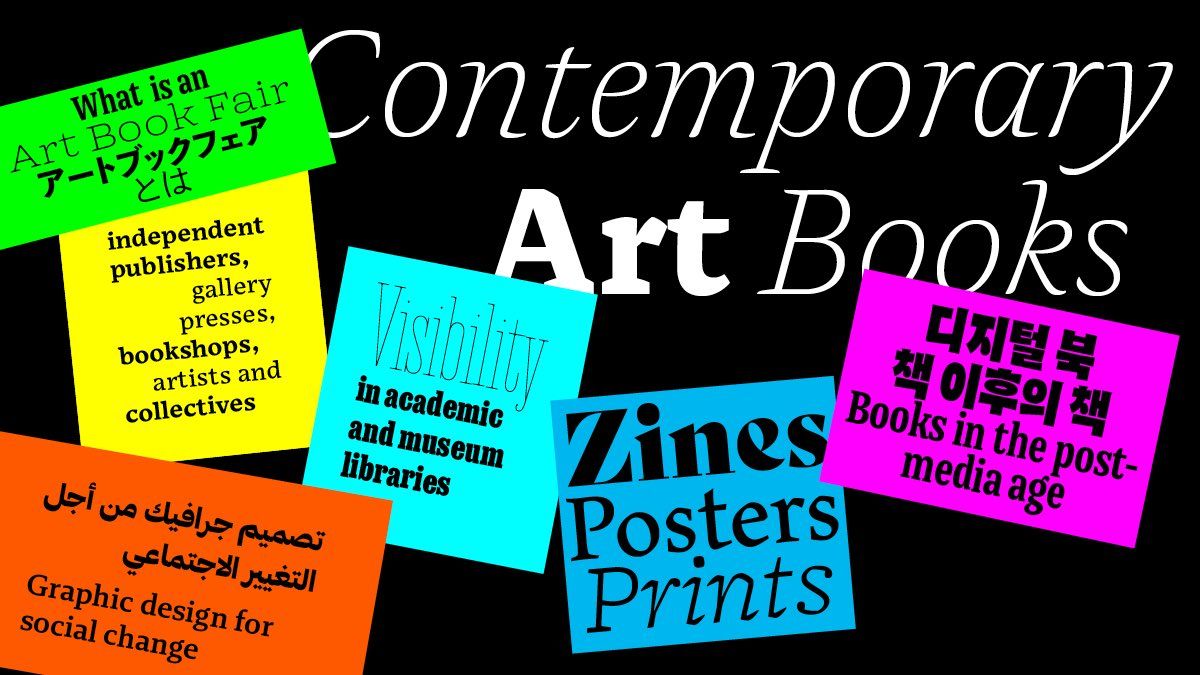
Search no further! Along with my talk at #AdobeMAX I put together a font pack I’m calling “International Art Book Fair” A collection of absolute bangers, all are contemporary designs from living designers. Arabic, Japanese, Korean & Latin are included fonts.adobe.com/collections/international-art-book-fair-fonts Adobe/1582114231214043136
-
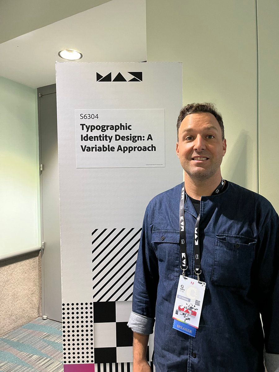
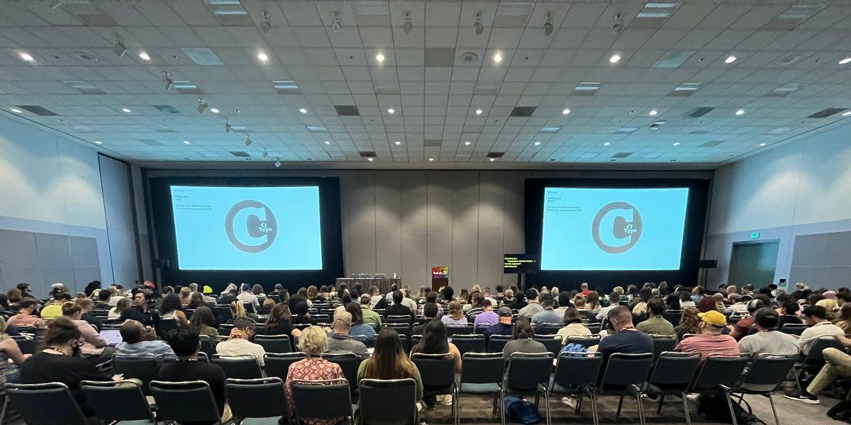
I’m excited to be speaking tomorrow at #AdobeMax about type in the context of identity design. If you’re attending, please come say hi 👋 I’ll have some goodies to give away. Thanks to AdobeFonts for asking me to speak
-
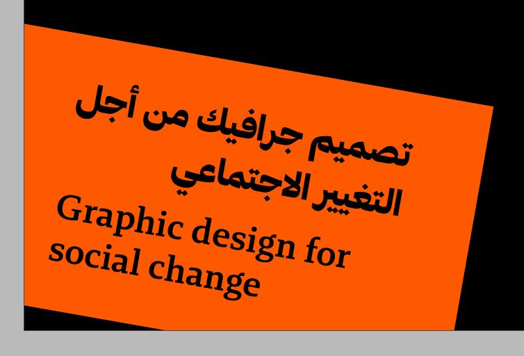
To my friends who read Arabic: Does this bilingual text look OK? Is the shaping correct? Is the line break happening at a reasonable place? Does the leading look OK? Thanks in advance!! (typeface is the wonderful Brando Arabic from boldmonday by waelmorcos and debakir )
-
Rob gave talk to my typography class earlier this year on his awesome ColdType/Blender projects His work is super inspiring, keeps pushing boundaries, and continues to blow my mind. Meanwhile, his presentation style is super chill and approachable. Can’t wait to see this talk! robstenson/1578470859924074496
-
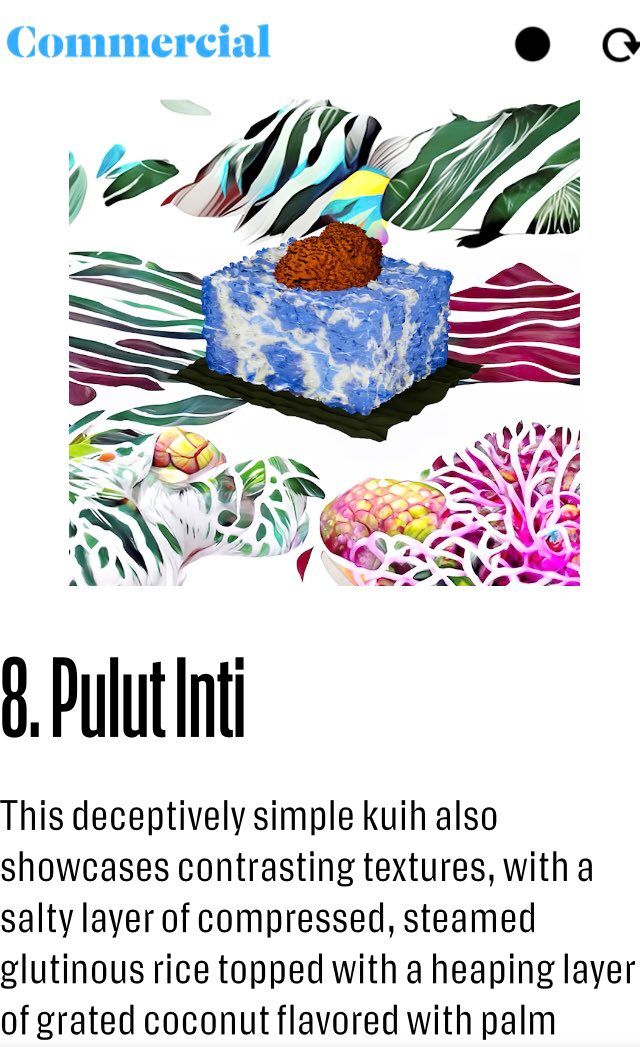
Check out this awesome type specimen/food guide from commercialtype featuring on one of my favorite spots in the LES, Kuih Café. My personal favorite is Pulut Inti If you like Southeast Asian desserts, another amazing place is Lady Wong on E.9th st foodissue.commercialtype.com/a-beginners-guide-to-kuih
-
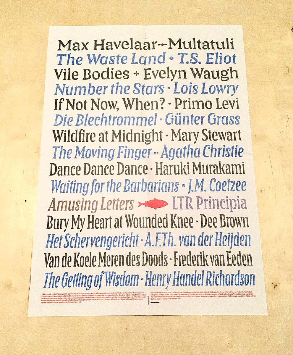
A new release from letterror is always an exciting day. In case you were wondering “Does LTR Principia work well for riso printing?” The answer is yes, it looks amazing letterror/1573225412276420608
-
“Design has evolved to meet the challenge of the new relationship between people and the material goods they need. Today, designers — artisans, manufacturers, engineers, architects — think far beyond the way things look.” Excellent essay by Matt Ström 👇 ilikescience/1572963839213182978
-
Fontra is an in-development browser-based font editor by blackfoundry & justvanrossum So exciting to see this running on my computer already Still in early stage dev, but it’s super fast! I’m convinced this will be part of our type design workflow in the near future. Gongrats! blackfoundry/1570365015819014144
-
Thank you, Peter, and the whole Fontstand team for an amazing conference PeterBilak/1569256988109950978
-
I can’t wait for the Fontstand conference this weekend! Who else is already in Den Haag this evening?
-
Wifi in de trein
-
I’m thinking of an image which shows a bunch of optical sizes of a lowercase a. It’s from foundry type meant for a small printed size up to a very large one, but all scaled to the same size so you can see the adjustments made. Does anyone know where I can find this image?
-
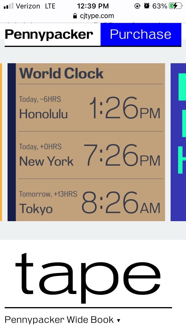
when I was making the promotional materials for my typeface Pennypacker I made a World Clock graphic. Then I decided to make it into an actual website: worldclock.cjtype.com which you are sent to when clicking on this graphic on cjtype.com/typefaces/pennypacker/ Simple, but fun to make✨ Mappletons/1561262483914084352
-
“Pens” in fonttools (and formerly in robofab) are super useful, but they always confuse me and I find myself going back to the documentation every time I use them. Here's a nice thread on with helpful resources which I will surely be referring back to. Thanks, colinmford ! colinmford/1557427113254330368
-
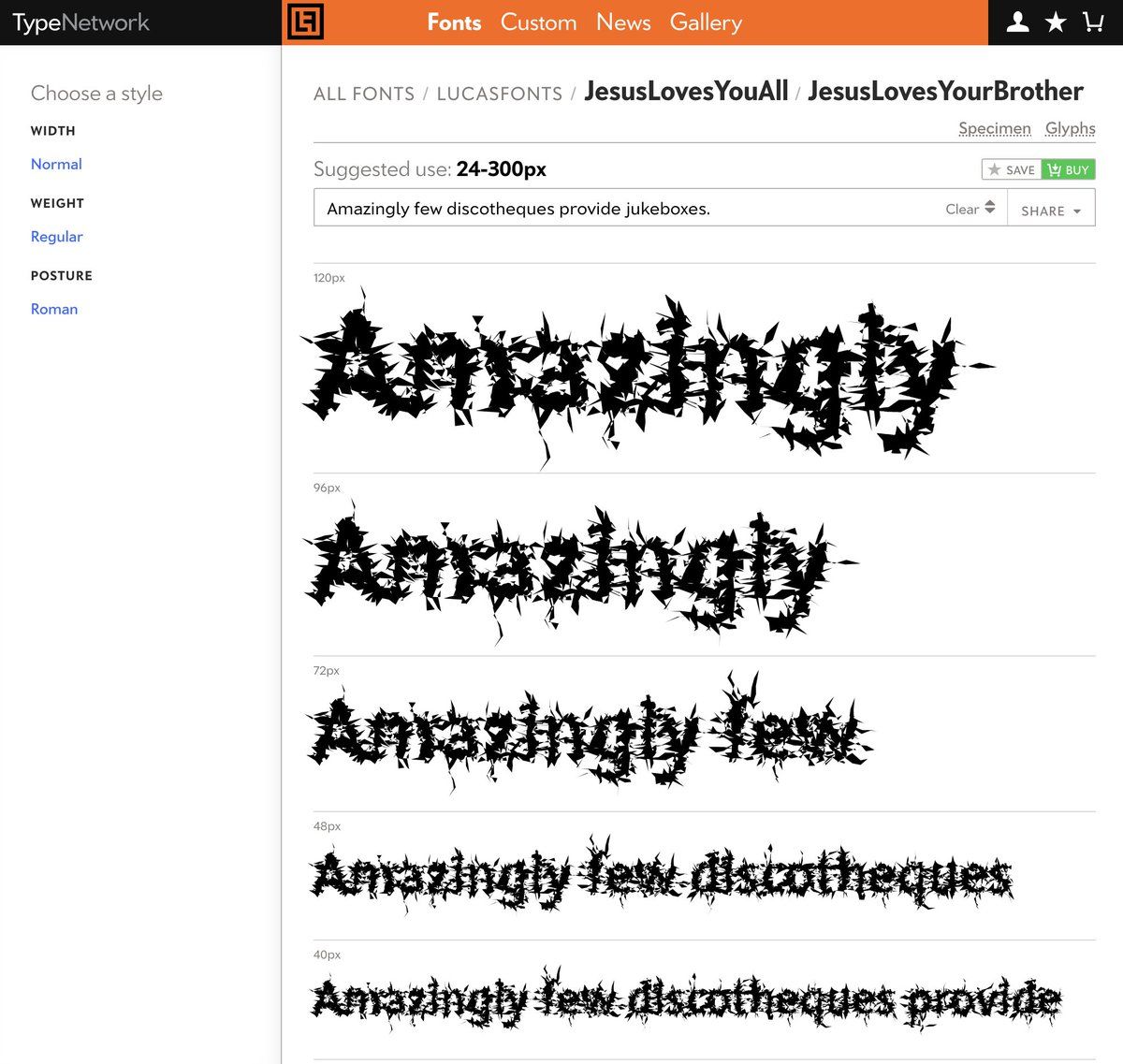
😍 the JesusLovesYouAll series is so chaotic, I love it. Try typing in JesusLovesYourBrother and watch the digital grime pile up. It's also fascinating to see how the readability changes at different sizes. Counterintuitively, I can read it way better at smaller sizes TypeNetwork/1557041579696824324
-
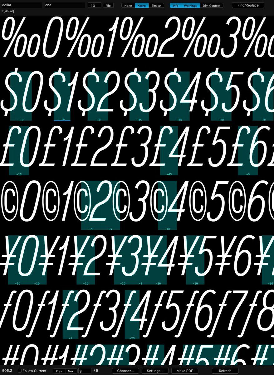
checkin my checkin my checkin my checkin my checkin my checkin my checkin my kerns youtu.be/J3ZbtrPh9P4?t=37
-
Listen to the new umru_ remixes album on a good pair of headphones, the sound design is pretty insane. Some of my favorites: honest (Jane Remover) umru.bandcamp.com/track/honest-umru-cecile-believe-jane-remover-remix check1 (Willy Crooks & Cali Cartier) umru.bandcamp.com/track/check1-umru-tommy-cash-645ar-william-crooks-cali-cartier-remix heart2 (Low Poly) umru.bandcamp.com/track/heart2-umru-rebecca-black-petal-supply-low-poly-remix
-
Louvette is from the future TypeNetwork/1554189459486347266
-
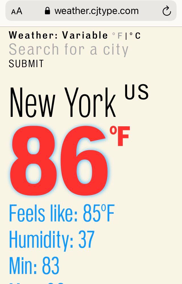
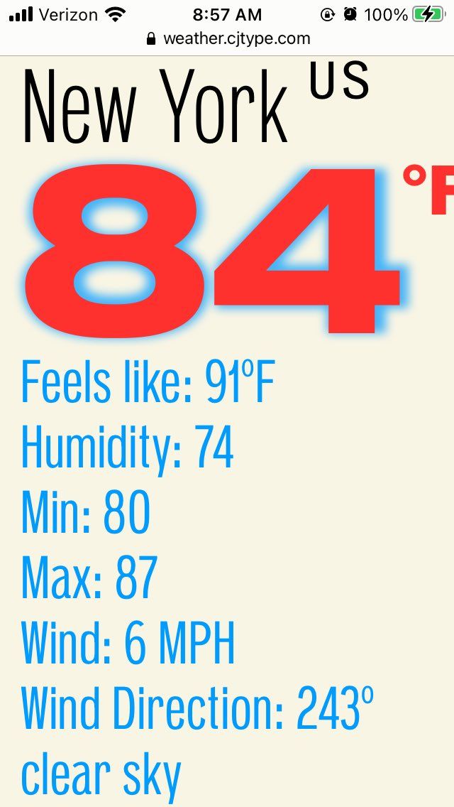
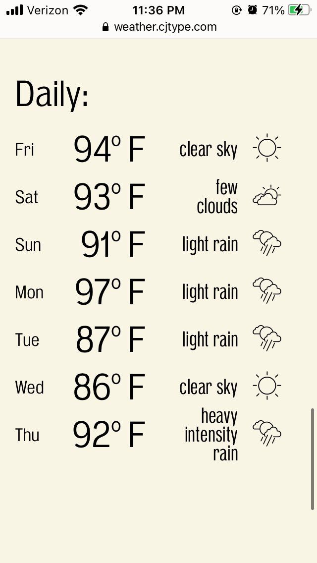
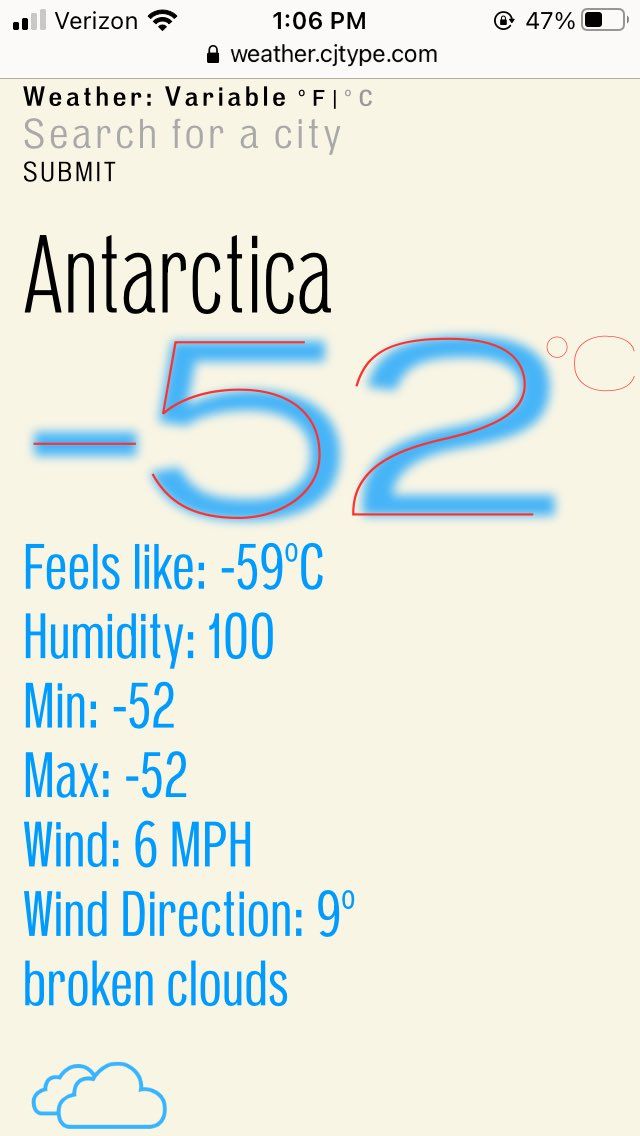
I noticed the numbers are much more narrow today on weather.cjtype.com than they have been lately, (width relates to humidity) and I immediately smiled knowing it will be a pleasant day outside my brain responds differently to these visual cues than to reading a number (37) cjtype/1551615391293898752
-
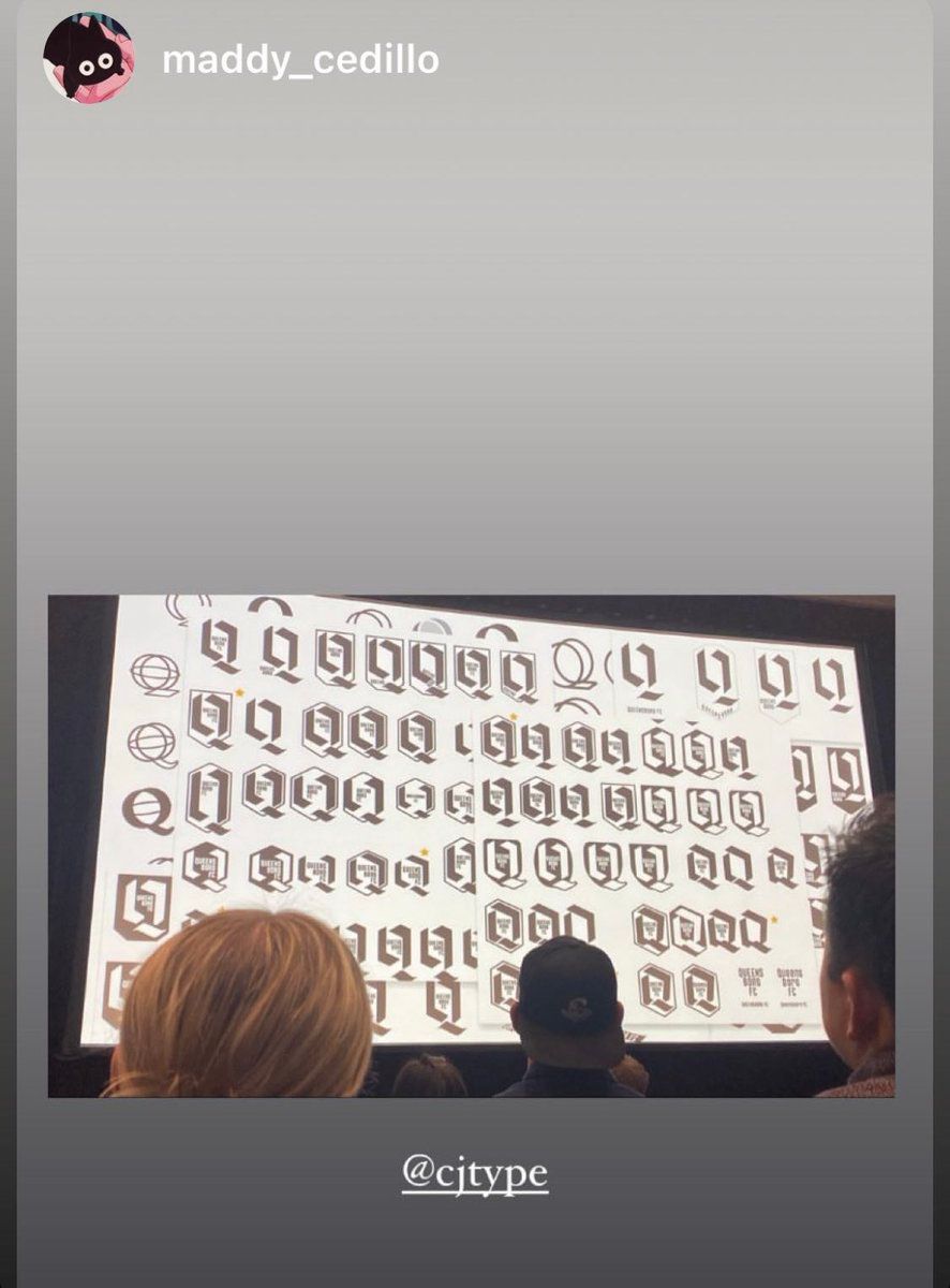
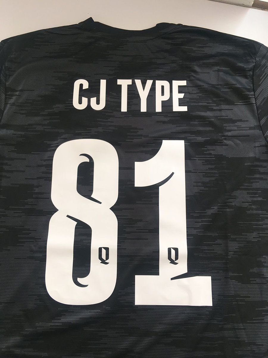
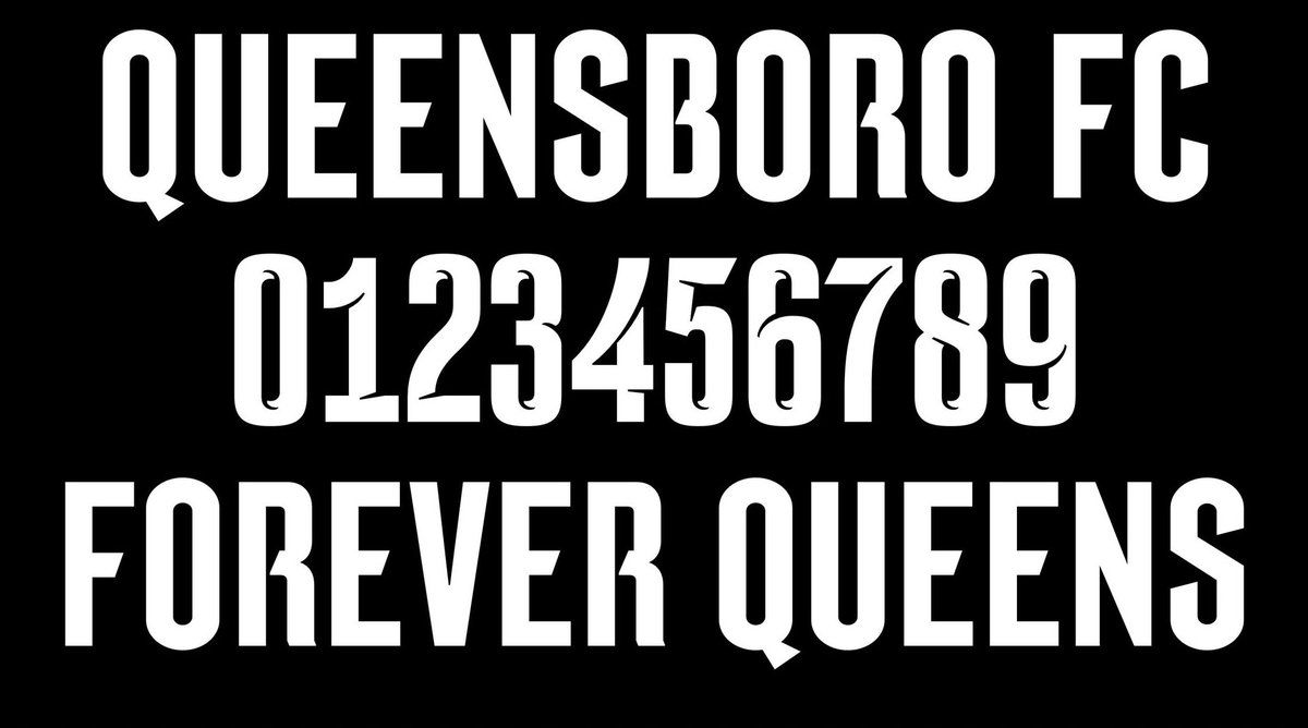
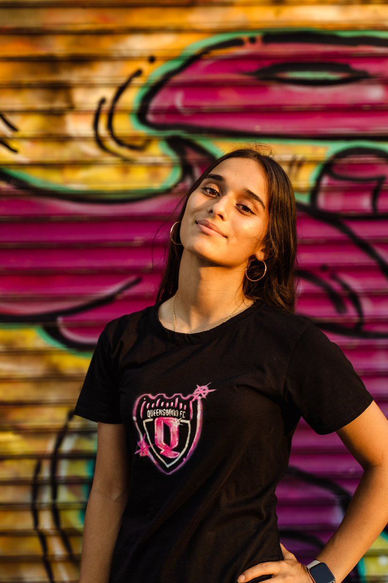
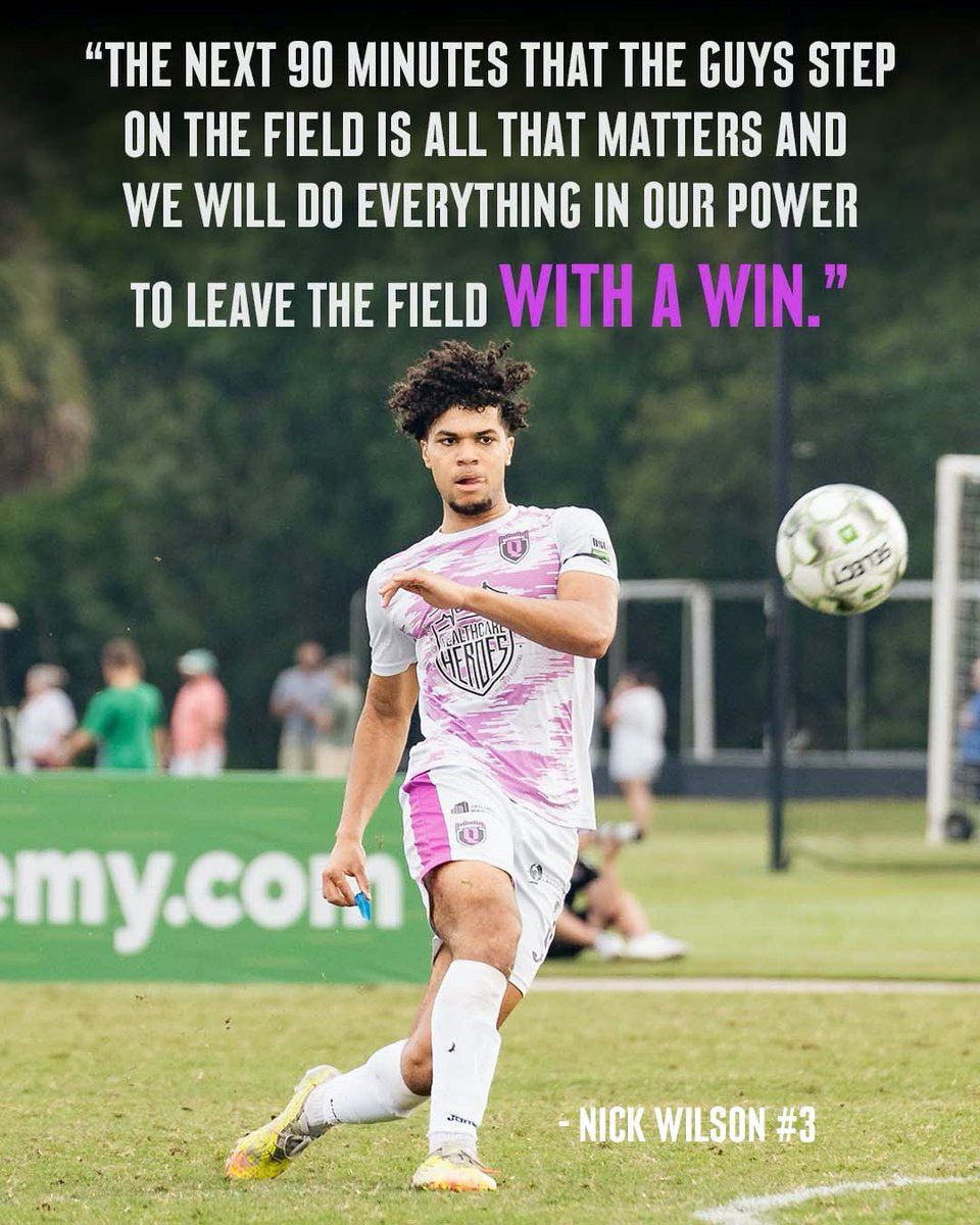
So proud to see the custom typeface we designed for Queensboro FC on their academy team, who just won the northeast championship, and are going on to the final 4 in the nation! Also first time I've seen a typeface of mine rendered in airbrush😎 More here: cjtype.com/gallery/queensboro-fc-custom-typeface/ QueensboroFC/1552707371948032001
-
I love drawbotapp because I was able to easily modify this handy script from ArrowType to run on multiple weight/width sources and output in a ton of different formats like .mp4 .gif .pdf or individual .png .jpg .tiff etc all from the same code base with very few changes ArrowType/1552357531489640449
-
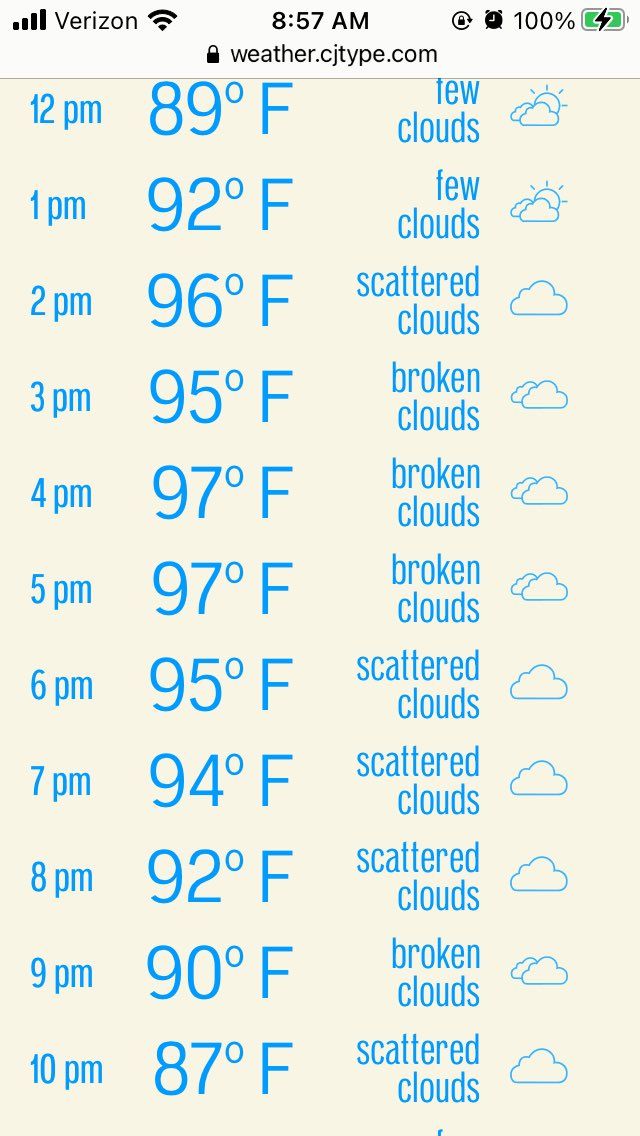
I built my own weather app because I wanted to use my Pennypacker variable font to visualize both temperature (weight) & humidity (width) I also love having only the info I care about, and in a much more readable format Let me know if you find it useful weather.cjtype.com yekalb/1551306866801664003
-
Yes!! ScaleFast is one of the G.O.A.T. extensions for roboFontEditor which I use constantly. Huge thanks to Loïc Sander EliasZi for designing this amazing tool and to those who have contributed to its latest versions: Gustavo, Frederic, Colin, Frank 🙏 github.com/roboDocs/ScaleFast tulseytype/1551269445309448193
-
Wow, this is a huge milestone!! If I understand correctly, the AVAR2 update will allow variable fonts to do amazing things not previously possible or practical. + Breaking the 65k glyph limit is major for CJK fonts like Source Han Serif/Sans which are currently limited here harfbuzz/1551260648629231618
-
graphic designers worried about AI index_space_org/1550201660382871552
-
a website where users ask questions about making typefaces, and the best answers get upvoted it’s called kern overflow (sorry)
-
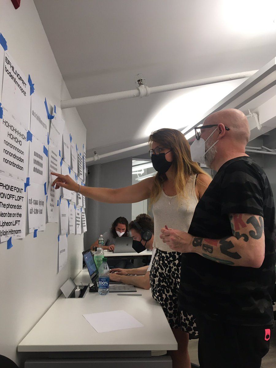
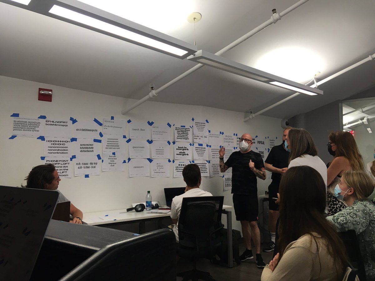
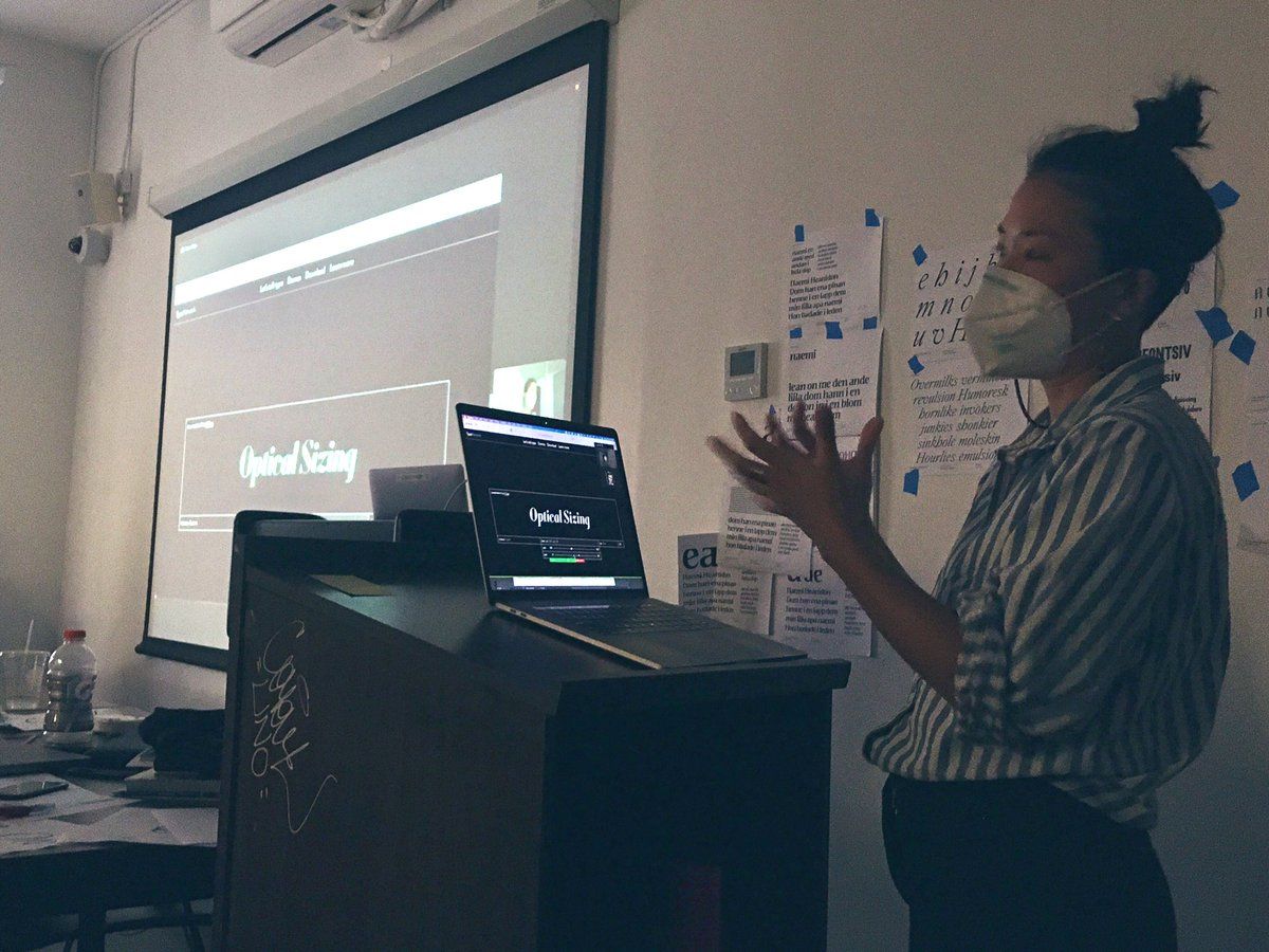
I’m happy to be helping teach type design SVATypeLab alongside Marie Otsuka of OccupantFonts this week, and with ultrasparky last week. It’s encouraging to see how much progress the students have made so far, and we’re only just past the halfway point
-
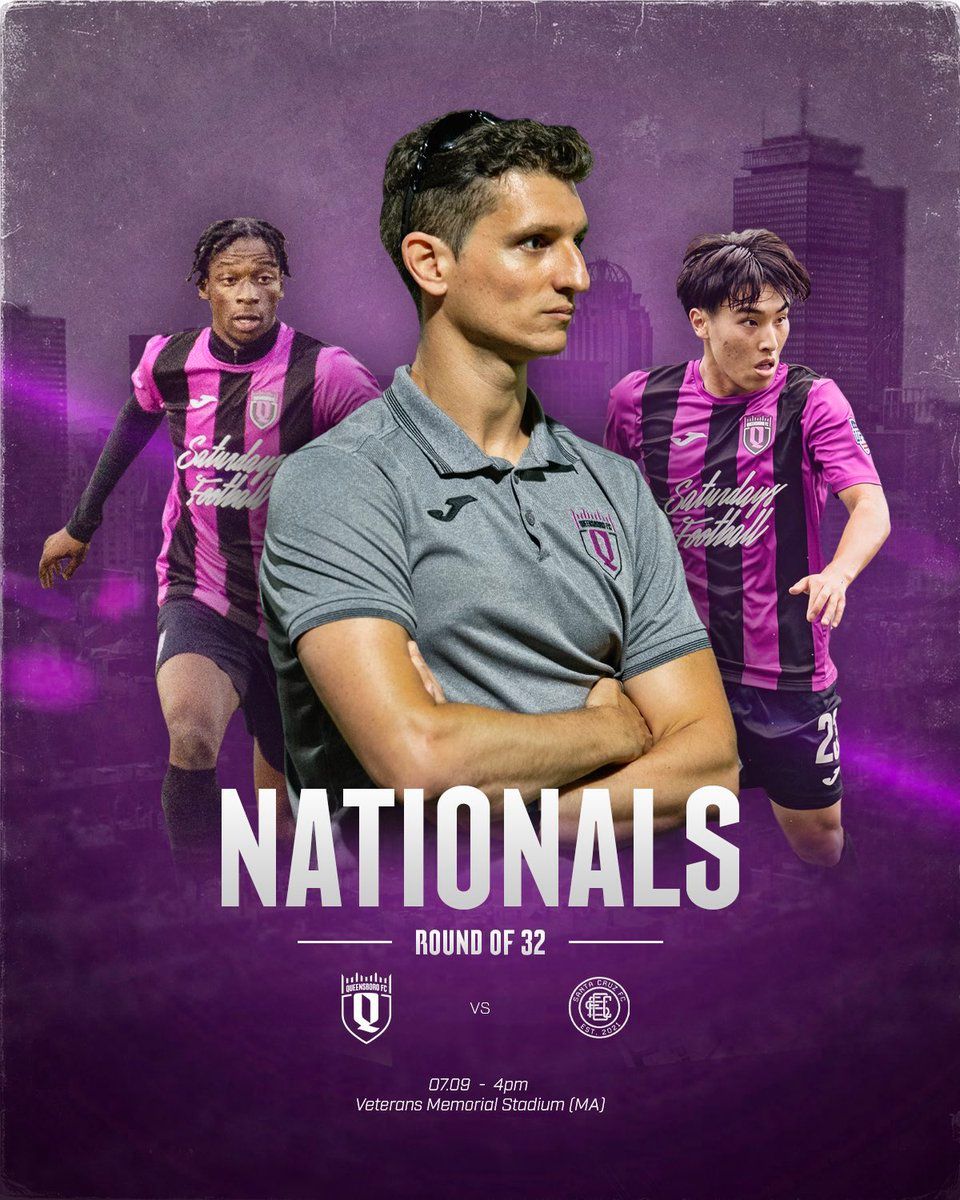
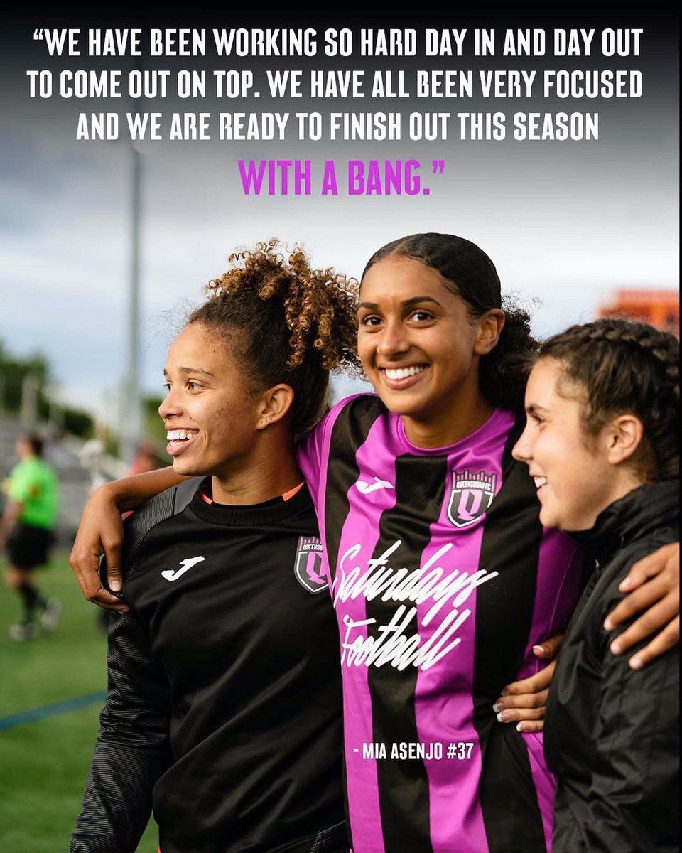
Fonts in use: Our custom typeface for Queensboro FC. I’ll be cheering for the QBFC Women’s team to win the division title today. And for the QBFC II Men’s team playing in the Nationals for the round of 32 later today. #ForeverQueens QueensboroFC/1545845940975706116
