-
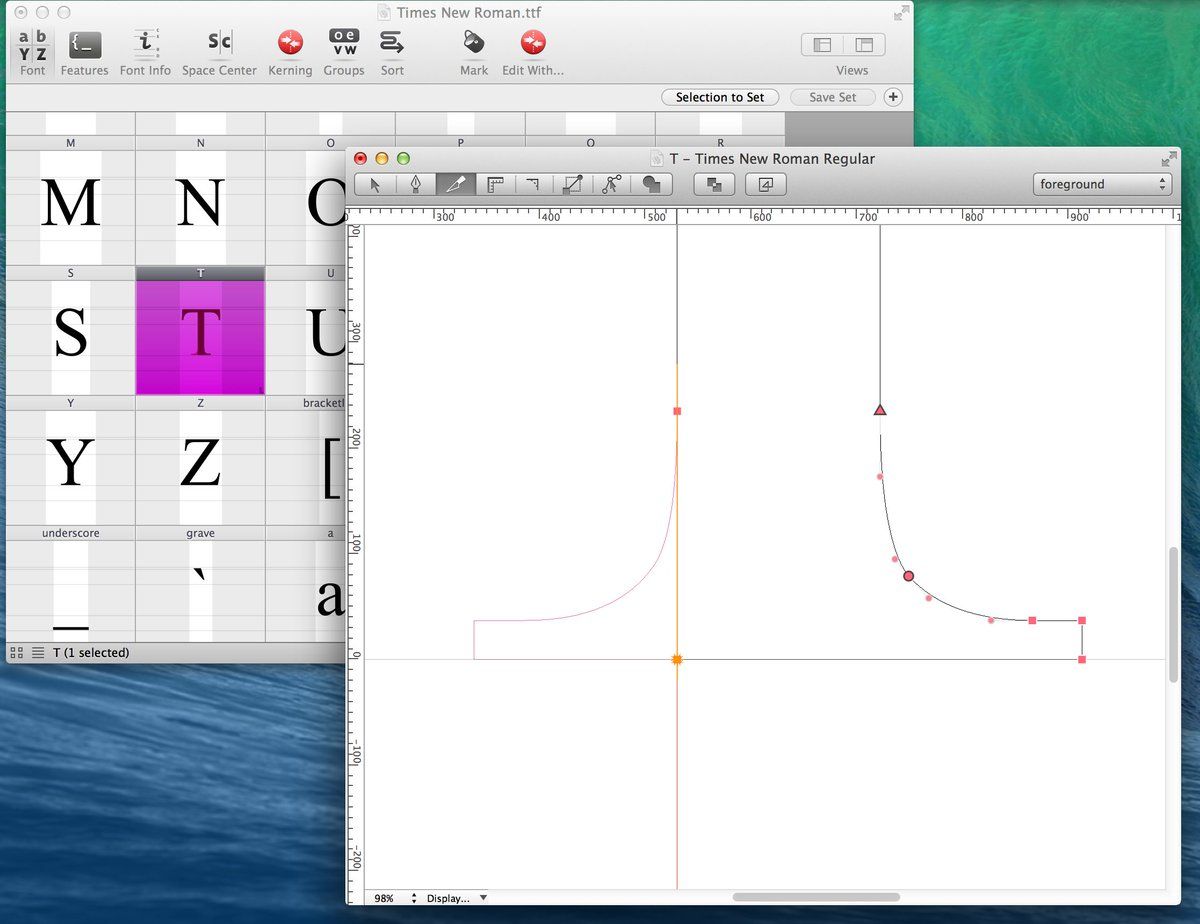
wolffolins.com/work/55/the-met Check out my “bespoke” design “deliberately combining serif and sans serif letterforms”
-
…in reply to @cjtype
Some designs actually combine/blur serif & sans in an interesting way, like the lovely Canela by font_taste or Carter Sans, or The Mix, &c
-
…in reply to @cjtype
…it's just sad reading that post about The Met logo knowing if that's what they really wanted it could have been so much nicer </rant>
