-
…in reply to @jerrysaltz
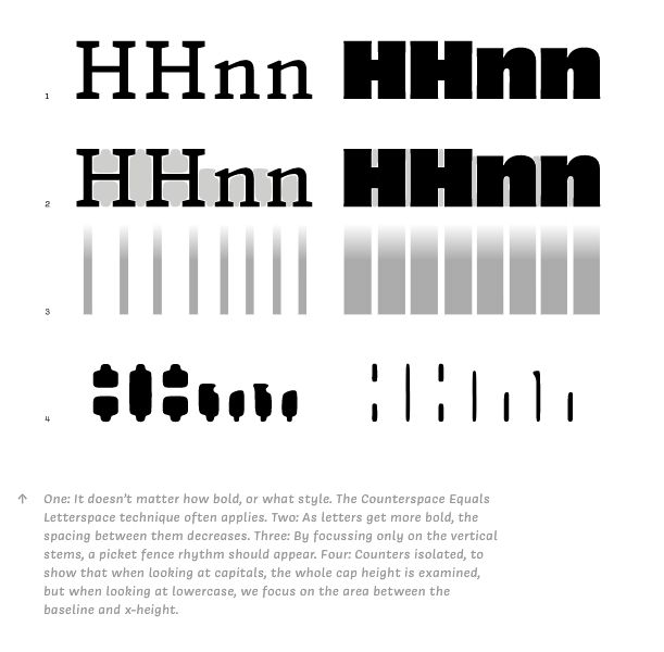
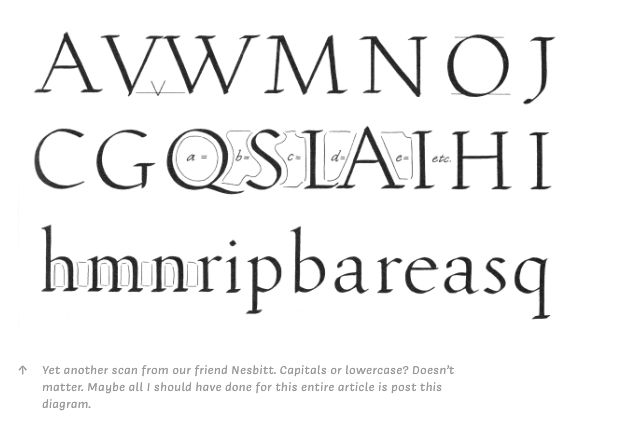
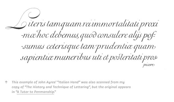
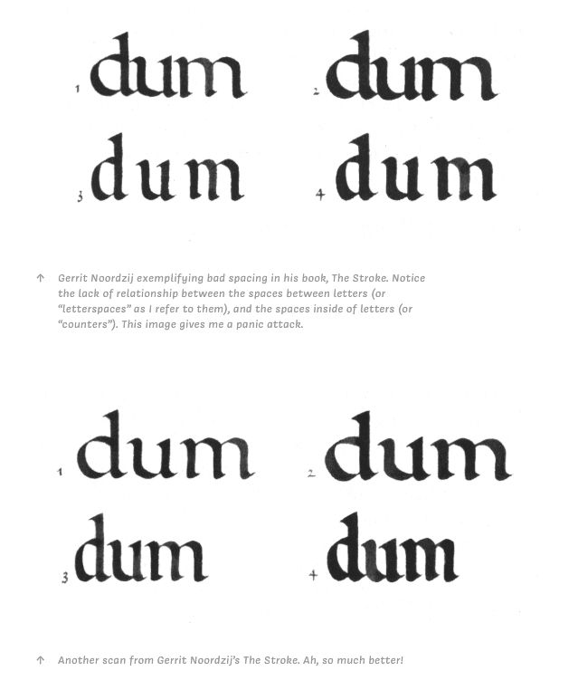
jerrysaltz This article by OHnoTypeCo about spacing in typeface design: ohnotype.co/blog/spacing has some helpful visuals (below) The majority of my work in designing type effectively is drawing negative space. This is crucial for defining the rhythm & texture of type, or “tone of voice”
-
…in reply to @cjtype
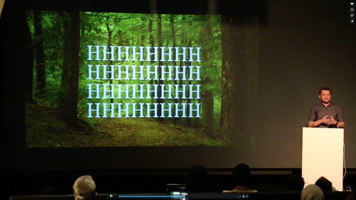
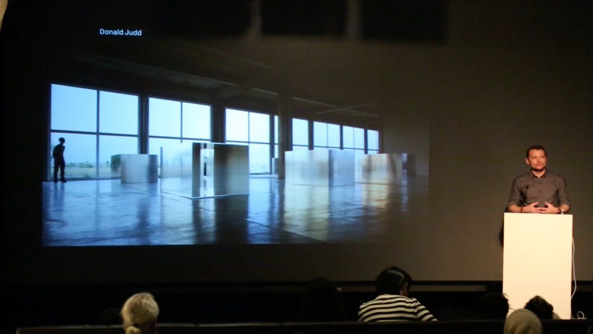
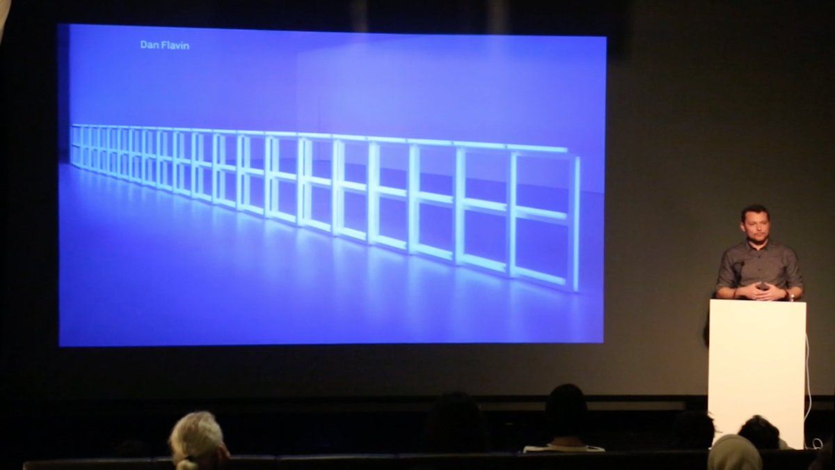
jerrysaltz Jerry, see also this excellent talk by opto vimeo.com/258287755 ~25:00 “Whitespace is not emptiness it’s structural space. It’s what adds rhythm & cadence into the way the eye will flow on the top of the letters, constructing meanings.” He references Judd, Flavin, Turrell…
